Dataviz Style Guide
Table of Contents
The companion to the Graphviz diagram canon: same six semantic color families, same
Helvetica in-chart, same restraint – extended to Python (matplotlib,
seaborn, plotly), Clojure (oz, hanami, Vega-Lite), and Mermaid. Drop
the snippets in and your charts read as siblings of every .dot
diagram on the site.
Related: wal.sh Design System.
Scope: bar, line, scatter, area, heatmap, small multiples.
1. First principles
Three rules that govern every chart. These mirror the diagram canon exactly, because a chart is a diagram with data attached. A reader who has learned to read one of our graphs should be able to read all of them.
1.1. Color encodes semantics, not series count
If a series represents success, it is green (#15803d). If it
represents error, it is red (#b91c1c). Pick the family from the
meaning, then assign it. A bar chart of four random metrics does not
get blue/purple/green/amber by default – pick by what each metric
means.
1.2. One axis is silent, one axis is loud
Gridlines: #eaeaea, only on the value axis, behind the data. Tick
labels and axis title: #666. Data labels: #1a1a1a. The chart
should read as one continuous tone with the data emerging from it –
not as a grid of competing rectangles.
1.3. The palette is a protocol, not a preference
The same six color families serve Graphviz, matplotlib, Vega-Lite, and Mermaid. Copy the hex values exactly – full six-digit lowercase. Do not substitute a "close enough" color. The coordination cost of keeping all diagrams aligned is paid precisely once, here, and recovered every time a reader moves between pages.
2. The palette
Six families and one accent. The fill is always the 100-weight; the stroke and text are always the 700-weight. The 50-weight is for backgrounds inside the chart (cluster fills, highlighted regions).
2.1. Six semantic families
| Family | Fill (100) | Stroke/Text (700) | Cluster BG (50) | Semantic role |
|---|---|---|---|---|
| Blue | #dbeafe |
#1d4ed8 |
#eff6ff |
Primary data flow, input, process |
| Purple | #ede9fe |
#6b21a8 |
#f5f3ff |
Abstraction, protocol, API, model |
| Green | #dcfce7 |
#15803d |
#f0fdf4 |
Output, success, storage, revenue |
| Amber | #fef3c7 |
#b45309 |
#fffbeb |
Config, threshold, SLO, target |
| Yellow | #fef9c3 |
#a16207 |
#fefce8 |
Warning, intermediate state, cache |
| Red | #fee2e2 |
#b91c1c |
#fef2f2 |
Error, critical path, failure, alert |
The 100-weight fills are pastel backgrounds. The 700-weight values serve triple duty: node border, node text, and series stroke. The 50-weight is for cluster/region backgrounds – lighter than the node fill so the region recedes behind its contents.
2.2. Chart chrome: neutrals
| Role | Value |
|---|---|
| Page background | #fafafa |
| Plot area background | #ffffff |
| Axis lines, spines | #666666 |
| Gridlines | #eaeaea |
| Tick labels, axis titles | #666666 |
| Chart title (above plot) | #1a1a1a |
| Annotation arrows, callouts | #555555 |
| De-emphasized / ghost series | #cccccc |
2.3. Sequential and diverging ramps (continuous data)
When the data is continuous (a heatmap, a gradient encoding), stretch the matching family between its 50-weight and its 700-weight.
- Sequential blue:
#eff6ff→#1d4ed8 - Sequential green:
#f0fdf4→#15803d - Diverging (error vs success):
#b91c1c←#ffffff→#15803d
Do not use jet or rainbow colormaps. Do not use the viridis or
plasma defaults unless you are encoding physical quantities where
those are the established convention.
3. Typography in charts
Helvetica, three sizes, always. The same rule as Graphviz:
fontname"Helvetica"= wins because it renders identically across
matplotlib's Agg backend, Cairo, Vega-Lite's SVG output, and Mermaid.
Inter is for chrome (titles, captions surrounding the chart); it does
not appear inside the plot.
| Role | Font | Size (pt) | Color | Weight |
|---|---|---|---|---|
| Chart title (above plot) | Inter | 14–16 | #1a1a1a |
700 |
| Subtitle / caption | Inter | 11–12 | #666666 |
400 |
| Axis title | Helvetica | 11 | #666666 |
500 |
| Tick labels | Helvetica | 10 | #666666 |
400 |
| Data labels (on-bar, point) | Helvetica | 10 | #1a1a1a |
500 |
| Legend | Helvetica | 10 | #666666 |
400 |
| Annotation arrows / callouts | Helvetica | 10 | #555555 |
400 |
4. Color encoding rules
Pick the family before you write the code. The archetype of the series determines its color.
4.1. Semantic assignment table
| If the series represents… | Family | Examples |
|---|---|---|
| The primary thing being measured | Blue | requests/sec, page views, the metric in the title |
| A model, forecast, or fitted line | Purple | regression line, ARIMA forecast, predicted/actual |
| A positive outcome or success state | Green | conversion rate, uptime, "passed", revenue |
| A target, threshold, or configured limit | Amber | SLO line, budget, target throughput |
| An intermediate state or warning | Yellow | queue depth, cache misses, "degraded" |
| An error, failure, or breach | Red | error rate, 5xx count, SLO violation, downtime |
4.2. Categorical with no inherent meaning
When series are genuinely peer categories (three datacenters in a
comparison plot), use the families in this order: Blue, Amber, Green,
Purple, Yellow, Red. This is the categorical-range defined in the
Clojure palette below and reflected in axes.prop_cycle in the
matplotlib style.
4.3. Highlight one series among many
The featured series uses its 700-weight. All other series collapse to
#cccccc at 1 px stroke. This is more useful than a legend and less
confusing than coloring everything.
5. Python: matplotlib, seaborn, plotly
One rcParams dict, three libraries. Drop this at the top of any
notebook or report. matplotlib picks it up directly; seaborn inherits
because it sits on top of matplotlib; plotly gets its own template
that produces the same chart.
5.1. walsh.mplstyle
Paste into ~/.config/matplotlib/stylelib/walsh.mplstyle or load
with plt.style.use('walsh.mplstyle').
# walsh.mplstyle -- wal.sh chart style
# Load with: plt.style.use('walsh')

figure.facecolor     : #fafafa
axes.facecolor       : #ffffff
axes.edgecolor       : #666666
axes.labelcolor      : #666666
axes.titlecolor      : #1a1a1a
axes.titleweight     : 700
axes.titlesize       : 14
axes.titlepad        : 12
axes.labelsize       : 11
axes.spines.top      : False
axes.spines.right    : False
axes.grid            : True
axes.grid.axis       : y
axes.axisbelow       : True
grid.color           : #eaeaea
grid.linewidth       : 0.8
grid.linestyle       : -
xtick.color          : #666666
ytick.color          : #666666
xtick.labelsize      : 10
ytick.labelsize      : 10
xtick.direction      : out
ytick.direction      : out
font.family          : Helvetica, Arial, sans-serif
font.size            : 10

# Six semantic families, ordered for categorical use
axes.prop_cycle : cycler('color', [
    '#1d4ed8', '#b45309', '#15803d',
    '#6b21a8', '#a16207', '#b91c1c'])

legend.frameon       : False
legend.fontsize      : 10
lines.linewidth      : 2.0
lines.solid_capstyle : round
patch.edgecolor      : #1d4ed8
patch.facecolor      : #dbeafe
5.2. Named color constants
Pin the semantic names in every script so the meaning is explicit at the call site.
# walsh_colors.py -- semantic palette constants
BLUE_FILL   = "#dbeafe"
BLUE_STROKE = "#1d4ed8"

PURPLE_FILL   = "#ede9fe"
PURPLE_STROKE = "#6b21a8"

GREEN_FILL   = "#dcfce7"
GREEN_STROKE = "#15803d"

AMBER_FILL   = "#fef3c7"
AMBER_STROKE = "#b45309"

YELLOW_FILL   = "#fef9c3"
YELLOW_STROKE = "#a16207"

RED_FILL   = "#fee2e2"
RED_STROKE = "#b91c1c"

# Chrome
BG         = "#fafafa"
PLOT_BG    = "#ffffff"
AXIS       = "#666666"
GRID       = "#eaeaea"
TEXT       = "#1a1a1a"
GHOST      = "#cccccc"

# Categorical order (non-semantic, peer categories)
CATEGORICAL = [BLUE_STROKE, AMBER_STROKE, GREEN_STROKE,
               PURPLE_STROKE, YELLOW_STROKE, RED_STROKE]
5.3. seaborn
seaborn inherits matplotlib's rcParams automatically. Set the
palette explicitly to override seaborn's defaults.
import seaborn as sns
from walsh_colors import CATEGORICAL

sns.set_theme(style="whitegrid", rc={
    "axes.facecolor": "#ffffff",
    "figure.facecolor": "#fafafa",
    "grid.color": "#eaeaea",
})
sns.set_palette(CATEGORICAL)
5.4. plotly template
import plotly.graph_objects as go
from walsh_colors import *

walsh_template = go.layout.Template(
    layout=go.Layout(
        font=dict(family="Helvetica, Arial, sans-serif",
                  color=AXIS, size=10),
        title=dict(font=dict(color=TEXT, size=14, family="Inter")),
        paper_bgcolor=BG,
        plot_bgcolor=PLOT_BG,
        colorway=CATEGORICAL,
        xaxis=dict(gridcolor=GRID, tickfont=dict(color=AXIS)),
        yaxis=dict(gridcolor=GRID, tickfont=dict(color=AXIS)),
        legend=dict(bgcolor="rgba(0,0,0,0)", font=dict(color=AXIS)),
    )
)

import plotly.io as pio
pio.templates["walsh"] = walsh_template
pio.templates.default = "walsh"
6. Clojure: oz, hanami, Vega-Lite
Vega-Lite is the substrate under oz, hanami, and Saite. A single config map themes them all.
6.1. Palette namespace
(ns walsh.viz)

(def palette
  "Six semantic families -- match the diagram canon exactly."
  {:blue   {:fill "#dbeafe" :stroke "#1d4ed8"}
   :purple {:fill "#ede9fe" :stroke "#6b21a8"}
   :green  {:fill "#dcfce7" :stroke "#15803d"}
   :amber  {:fill "#fef3c7" :stroke "#b45309"}
   :yellow {:fill "#fef9c3" :stroke "#a16207"}
   :red    {:fill "#fee2e2" :stroke "#b91c1c"}})

(def categorical-range
  "Ordered for non-semantic categorical use."
  ["#1d4ed8" "#b45309" "#15803d"
   "#6b21a8" "#a16207" "#b91c1c"])

(def config
  "Merge into every Vega-Lite spec under :config."
  {:background "#fafafa"
   :view       {:stroke "transparent"}
   :axis       {:grid true
                :gridColor "#eaeaea"
                :gridWidth 0.8
                :labelColor "#666666"
                :titleColor "#666666"
                :labelFont  "Helvetica"
                :titleFont  "Helvetica"
                :labelFontSize 10
                :titleFontSize 11}
   :title      {:color "#1a1a1a"
                :font "Inter"
                :fontSize 14
                :fontWeight 700}
   :legend     {:labelFont  "Helvetica"
                :titleFont  "Helvetica"
                :labelColor "#666666"
                :titleColor "#666666"}
   :range      {:category categorical-range}})
6.2. Use with oz
(require '[oz.core :as oz])
(require '[walsh.viz :as viz])

(oz/view!
  (merge-with merge
    {:data    {:values data}
     :mark    {:type "line" :color (get-in viz/palette [:blue :stroke])}
     :encoding {:x {:field "date" :type "temporal"}
                :y {:field "value" :type "quantitative"}}}
    {:config viz/config}))
6.3. Use with hanami
(require '[aerial.hanami.common :as hc])
(require '[aerial.hanami.templates :as ht])
(require '[walsh.viz :as viz])

(hc/update-defaults
  :USERDATA {:config viz/config})
7. Mermaid
Mermaid covers what Graphviz cannot easily do in-browser: Gantt charts, sequence diagrams, ER diagrams, pie charts. Prefix every diagram with this init block – it makes Mermaid render in the wal.sh family.
%%{init: {
  "theme": "base",
  "themeVariables": {
    "fontFamily":           "Helvetica, Arial, sans-serif",
    "fontSize":             "13px",
    "background":           "#fafafa",
    "primaryColor":         "#dbeafe",
    "primaryBorderColor":   "#1d4ed8",
    "primaryTextColor":     "#1d4ed8",
    "secondaryColor":       "#ede9fe",
    "secondaryBorderColor": "#6b21a8",
    "secondaryTextColor":   "#6b21a8",
    "tertiaryColor":        "#dcfce7",
    "tertiaryBorderColor":  "#15803d",
    "tertiaryTextColor":    "#15803d",
    "lineColor":            "#888888",
    "textColor":            "#666666",
    "mainBkg":              "#dbeafe",
    "clusterBkg":           "#ffffff"
  }
}}%%
Mermaid is appropriate for: sequence diagrams, Gantt charts, ER diagrams, state diagrams, class diagrams. Use Graphviz for any layout where you need precise edge routing or complex cluster nesting. See diagram-style-guide for the Graphviz archetypes.
8. Examples
Generated with matplotlib and gnuplot using the canonical palette.
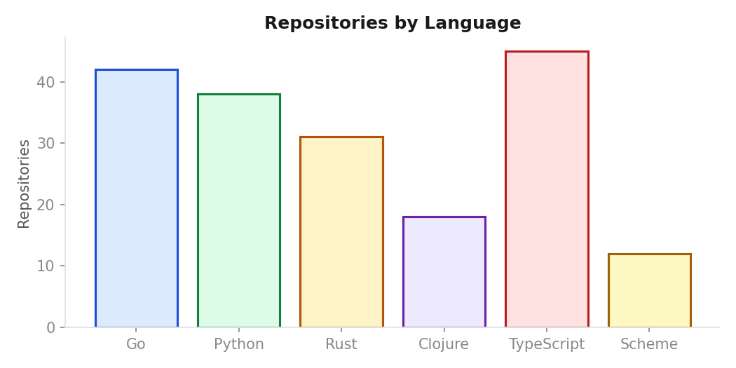
8.1. Bar chart
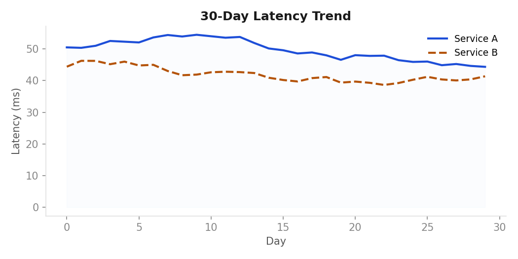
8.2. Line chart
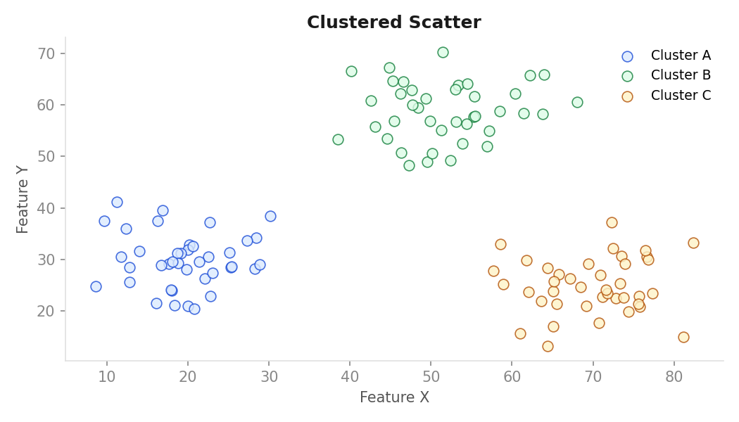
8.3. Scatter plot
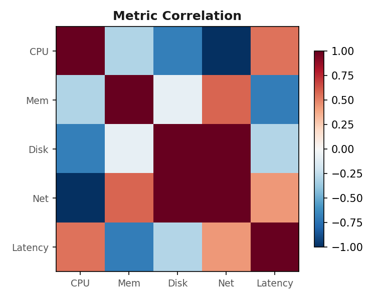
8.4. Heatmap
8.5. Gnuplot
9. Chart archetypes
Six shapes. Pick the archetype before you write the spec. The archetype decides defaults; the color family decides encoding.
9.1. Bar: categorical comparison
Vertical bars when categories are short labels; horizontal when they are not. Bars are filled with the 700-weight color, no stroke, no rounding. Use one color per bar only when each bar means something different; otherwise all bars in blue 700.
Conventions:
- Sort descending by value unless the category order is meaningful
- Y-axis always starts at 0
- No legend when all bars share one color – use the title instead
- Max 12 bars before switching to a table or a top-N + "other" slice
Fig 08.1 -- error rate by service (blue, ordered descending)
  2.0% |
  1.5% |  ■
  1.0% |  ■  ■
  0.5% |  ■  ■  ■  ■  ■
   0%  +--+--+--+--+--+--
       auth orders search media profile geo
9.2. Line: series over time
2 px stroke, round joins. If you have multiple series, only the primary one is blue; the rest follow the categorical order. Threshold lines are amber dashed; alert moments are red callouts (small filled triangle on the time axis).
This archetype is the site's most common chart. The advisory daily
counts charts (advisory-daily-counts.png, atcscc-cache.png) use
this archetype: blue primary series, amber dashed threshold at +2 SD,
red dot markers on exceedances.
Conventions:
- Show the threshold in the subtitle rather than a legend entry
- If the series has gaps (missing data), show them as dashed segments or explicit gap markers rather than connecting across the void
- Annotate significant events with a vertical rule in
#ccccccand a short label in Helvetica 10 above the axis
9.3. Scatter: relationship between two quantities
Points: 60 px² square markers (Vega-Lite default size 60), no
stroke. Use opacity: 0.6 when overplotting is likely. A fit line,
if present, is purple at 1.5 px, no markers.
9.4. Stacked area: composition over time
Use only when the stack genuinely sums to a meaningful total. Each layer uses its semantic family's 100-weight fill with a 1 px 700-weight stroke between layers. Limit to 4 layers; beyond that switch to small multiples.
9.5. Heatmap: two categorical axes, one quantity
Sequential ramp from the family's 50-weight to its 700-weight (e.g.,
blue: #eff6ff → #1d4ed8). Cells are square, 1 px gap, no border.
Annotate the cell value in Helvetica 10; color flips to white when the
cell is darker than #888888.
9.6. Small multiples: same chart, many slices
Grid of identical charts, one slice each. Share axes
(resolve: {scale: {y: "shared"}} in Vega-Lite). Each panel's series
uses the same color – the slice is the variable, not the encoding.
Label panels with their slice value above the chart area, Helvetica
12, #666666.
10. Tool selection: when to use what
The right tool depends on the output format, the update frequency, and the complexity of the layout.
| Scenario | Tool | Format | Notes |
|---|---|---|---|
| System architecture, pipelines, DAGs | Graphviz | SVG/PNG | Canonical. Edge routing, cluster nesting |
| Time series, bar, scatter in reports | matplotlib | SVG/PNG | Use walsh.mplstyle; gnuplot for org-babel |
| Interactive dashboards or org HTML export | Vega-Lite | SVG | Via oz or hanami in Clojure; Altair in Python |
| Sequence, Gantt, ER, state diagrams | Mermaid | SVG | Use the init block from Section 7 |
| One-off static charts in org documents | gnuplot | PNG/SVG | Already supported in org-babel, low deps |
| Animated or highly custom layouts | D3 / SVG | SVG | Last resort – only if no archetype fits |
10.1. gnuplot in org-babel
gnuplot is available on the site's publishing host and renders
cleanly inside org-mode without additional dependencies. Use it for
charts that live inside a single .org file.
set terminal pngcairo size 800,450 enhanced font "Helvetica,10" \
    background "#fafafa"
set output 'chart.png'

set border lc rgb "#666666"
set grid ytics lc rgb "#eaeaea" lw 0.8
set xtics textcolor rgb "#666666"
set ytics textcolor rgb "#666666"
set xlabel "Date" textcolor rgb "#666666"
set ylabel "Count" textcolor rgb "#666666"
set title "Request rate" textcolor rgb "#1a1a1a" font "Helvetica,14"

# Primary series in blue 700
set style line 1 lc rgb "#1d4ed8" lw 2 pt 7 ps 0.8
# Threshold in amber dashed
set style line 2 lc rgb "#b45309" lw 1.5 dt 2
# Exceedance dots in red
set style line 3 lc rgb "#b91c1c" pt 7 ps 1.2

plot data using 1:2 with linespoints ls 1 title "", \
     threshold with lines ls 2 title ""
10.2. Graphviz vs gnuplot vs Vega-Lite decision tree
- Is this a graph (nodes + edges)? Use Graphviz.
- Is this a time series, bar, scatter, or distribution plot? Use gnuplot for org-mode documents, Vega-Lite for interactive or web output, matplotlib for Python notebooks.
- Is this a sequence diagram, Gantt, or ER diagram? Use Mermaid.
- Does it need interactivity or animation? Use Vega-Lite or D3/SVG.
11. Export and embedding
Ship SVG when you can; PNG at 2x when you cannot.
| Tool | Format | Setting |
|---|---|---|
| matplotlib | SVG | fig.savefig('chart.svg', bbox_inches'tight', facecolor='#fafafa')= |
| matplotlib | PNG | dpi=144 (already in style); use dpi=200 for print |
| Vega-Lite | SVG | oz: (oz/export! spec "chart.svg") |
| Vega-Lite | PNG | via vl-convert: vl-convert vl2png chart.json chart.png --scale 2 |
| Plotly | SVG/PNG | fig.write_image('chart.svg', width=800, height=450, scale=2) |
| Mermaid | SVG | mmdc -i diagram.mmd -o diagram.svg -t base -c theme.json |
| gnuplot | PNG | set terminal pngcairo size 800,450 font "Helvetica,10" |
11.1. Embedding in org-mode
Always include #+CAPTION, #+NAME, and #+ATTR_HTML with a
descriptive :alt text. The alt text describes what the chart shows,
not what type of chart it is.
Request rate vs SLO target, last 6 days file:chart.svg
For Graphviz diagrams built with org-babel, use :file diagram.png
in the src block header and add the same caption/name/attr-html block
immediately after the closing #+end_src.
12. What to avoid
These mistakes signal that the chart was not designed; it was generated and pasted.
- Default library palettes. matplotlib's
tab10, seaborn'sdeep, plotly'sPlotly, Vega'stableau10. They make the chart look like a tutorial. - Rainbow or jet colormaps. Use the sequential blue ramp or the diverging red/blue ramp.
- 3D bars, 3D pie, or any 3D anything. The third dimension adds no information and destroys the ability to read off accurate values.
- Pie charts beyond 4 slices. Use a horizontal bar chart instead. Past 4 slices no one can compare the angles.
- Gradient fills on bars. Bars are flat 700-weight. The gradient implies a continuous quantity that does not exist.
- Drop shadows on data marks. This is a decorative element with no semantic content.
- Truncated Y-axes on bar charts. Bar charts must start at 0. On line charts a truncated axis is fine and often preferable.
- More than 6 series on one plot. Switch to small multiples.
- Legends on a chart with one series. Use the series color in the title or subtitle instead.
- Color as the only encoding of a categorical distinction. Always pair with shape (scatter), pattern (bar fill), or direct labels.
- Custom hex values that "almost match" the canon. Copy the values
from this page exactly – rounding to
#1d50d8or#15803ebreaks the consistency contract.